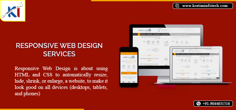
Mastering Responsive Web Design for Success
In today’s digital age, where smartphones, tablets, laptops, and desktops are all part of the daily tech experience, having a website that adapts to every device screen size is essential. This is where responsive web design (RWD) comes into play. Responsive web design is a design technique that ensures your website’s layout, images, and overall user experience adjust automatically based on the screen size and resolution of the device being used. This approach is no longer just a trend, but a standard for businesses, organizations, and individuals looking to create an engaging and seamless online presence.
Why Responsive Web Design is Important
1. Enhanced User Experience:
The goal of responsive web design is to provide an optimal browsing experience for users no matter what device they are using. Whether a visitor is accessing your website from a large desktop monitor or a small mobile phone, they should be able to navigate your site easily, with minimal zooming or scrolling. A website that adjusts seamlessly to different screen sizes provides a much better user experience and keeps visitors engaged.
2. Improved SEO Performance :
Google has long recommended responsive web design for better SEO (Search Engine Optimization). Since responsive websites use a single URL, they make it easier for Google to crawl and index the site. This boosts your rankings and ensures that your site appears in search results across all devices. Sites with a mobile friendly design have an edge in search engine rankings over those that are not optimized for mobile use.
3. Cost-Effective :
Before the era of responsive web design, businesses had to create separate mobile websites to cater to mobile users, which often involved extra development, maintenance, and costs. With responsive web design, you only need one website that works across all platforms, which saves both time and money in the long run.
4. Higher Conversion Rates :
A website that delivers an exceptional user experience on every device is more likely to convert visitors into customers. Whether the goal is to increase sales, gather leads, or encourage sign-ups, responsive design can lead to higher conversion rates. When users can easily navigate and interact with your website, they are more likely to complete the desired action, such as making a purchase or submitting a contact form.
5. Adaptation to Future Technologies :
One of the significant advantages of responsive design is that it is future-proof. As new devices and screen sizes emerge, a responsive website is already prepared to adjust. Whether it’s a new smartphone, wearable device, or even a virtual reality headset, responsive web design ensures that your site will remain accessible and functional.
Key Elements of Responsive Web Design
Responsive web design isn’t just about fitting content to a screen; it involves several key components:
– Flexible Layouts : This means the layout adjusts based on the screen size using a fluid grid system.
– Responsive Images : Images resize depending on the screen, ensuring they are not too large or small for the user’s device.
– Media Queries : These are CSS techniques that help tailor the website design to the specific screen size or device being used.
– Mobile-First Design : Many designers begin their design process by optimizing for mobile devices first, then scaling up to larger screens.
Conclusion
In conclusion, responsive web design is not just a luxury; it’s a necessity for businesses and individuals who want to remain competitive in today’s digital world. It offers a host of benefits including improved user experience, better SEO performance, cost-effectiveness, higher conversion rates, and future adaptability. If your website is not yet responsive, now is the perfect time to make the change and ensure that your online presence meets the expectations of today’s device-savvy users.